1/4
Independent artisan Lachlan Tobiason approached us to devise a logo mark for his handmade knives. His single thought-starter was the word “lock,” a homonym for his nickname.
We found ourselves exploring ideas around codes, languages, and other symbolic systems that unlock meaning. After exploring concepts ranging from a very literal cipher designs to plays on American Sign Language, we settled on pulling inspiration from Braille, a system of writing primarily used by visually impaired people.
It represents a junction between the visual and the tactile—rendering what is most typically only legible through vision, and making it felt in the mind’s eye. The sentiment felt especially resonant for a craftsperson who created something meaningful with their hands.
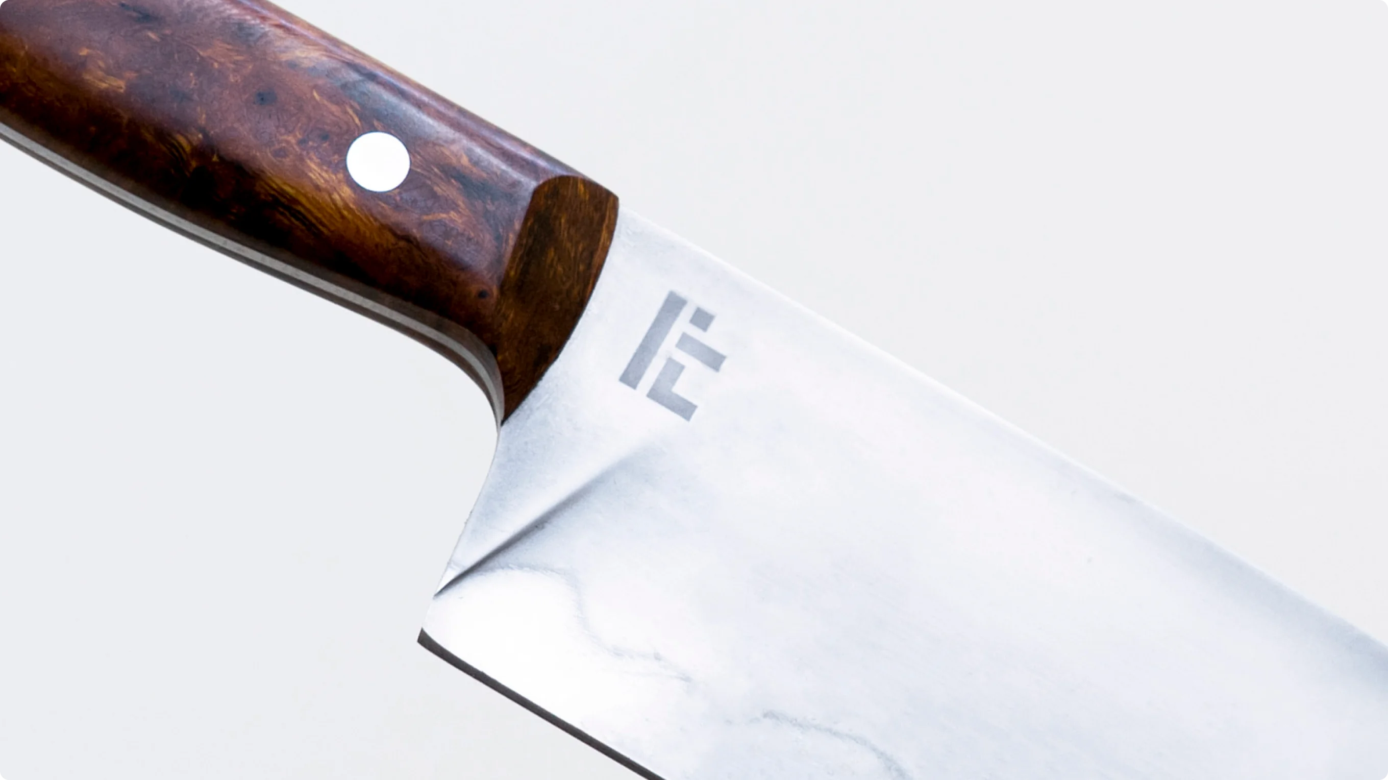
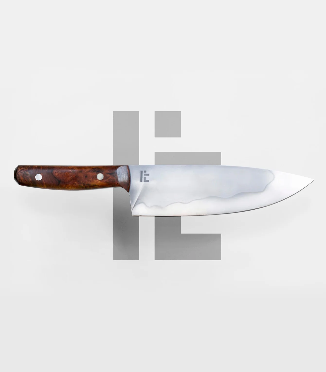
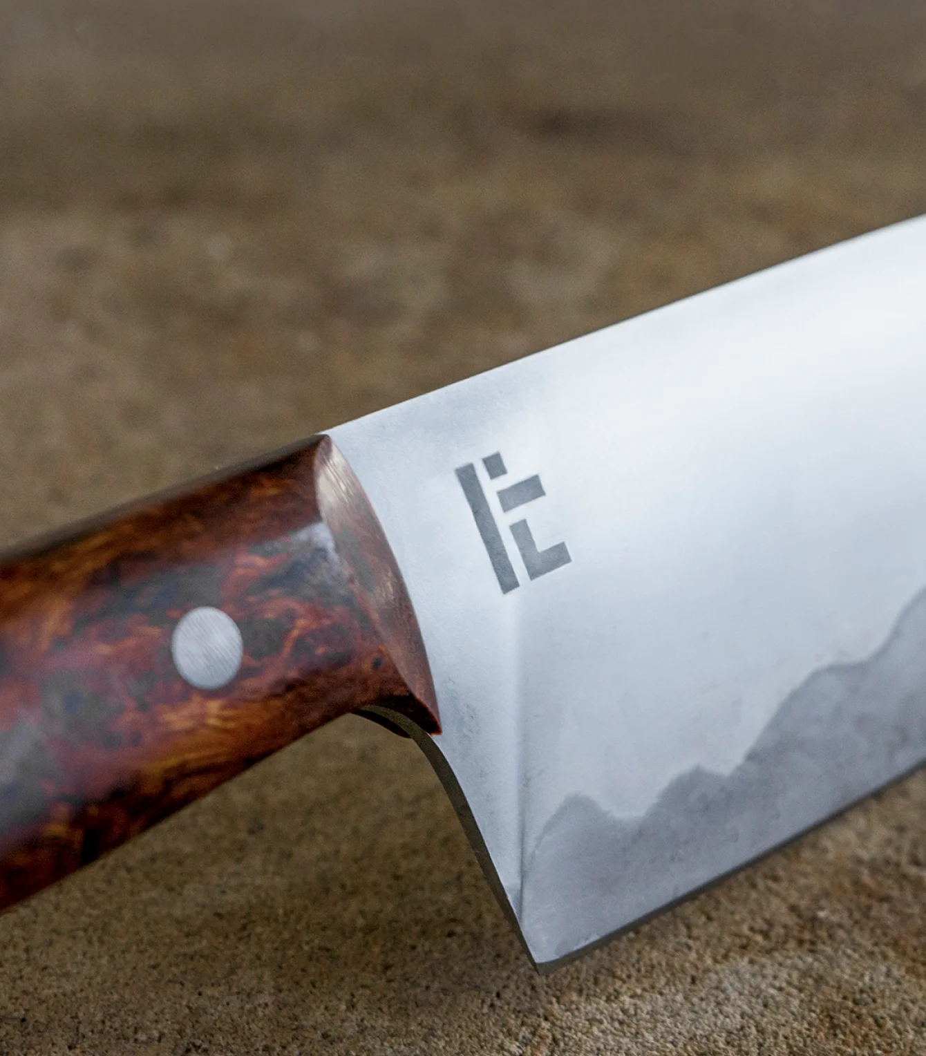
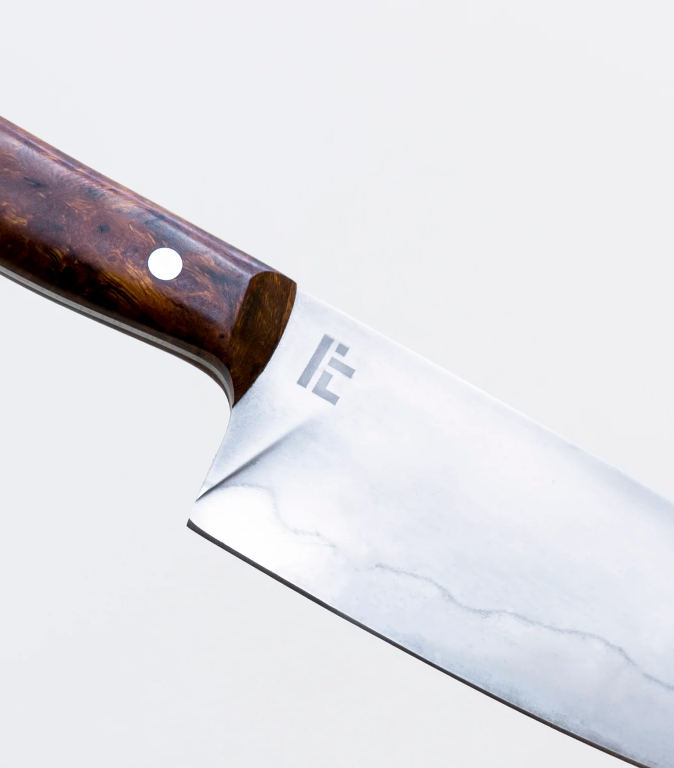
The final mark abstracts and condenses the Braille spelling of “Lach” into a geometric personal seal, which was acid etched into every blade.
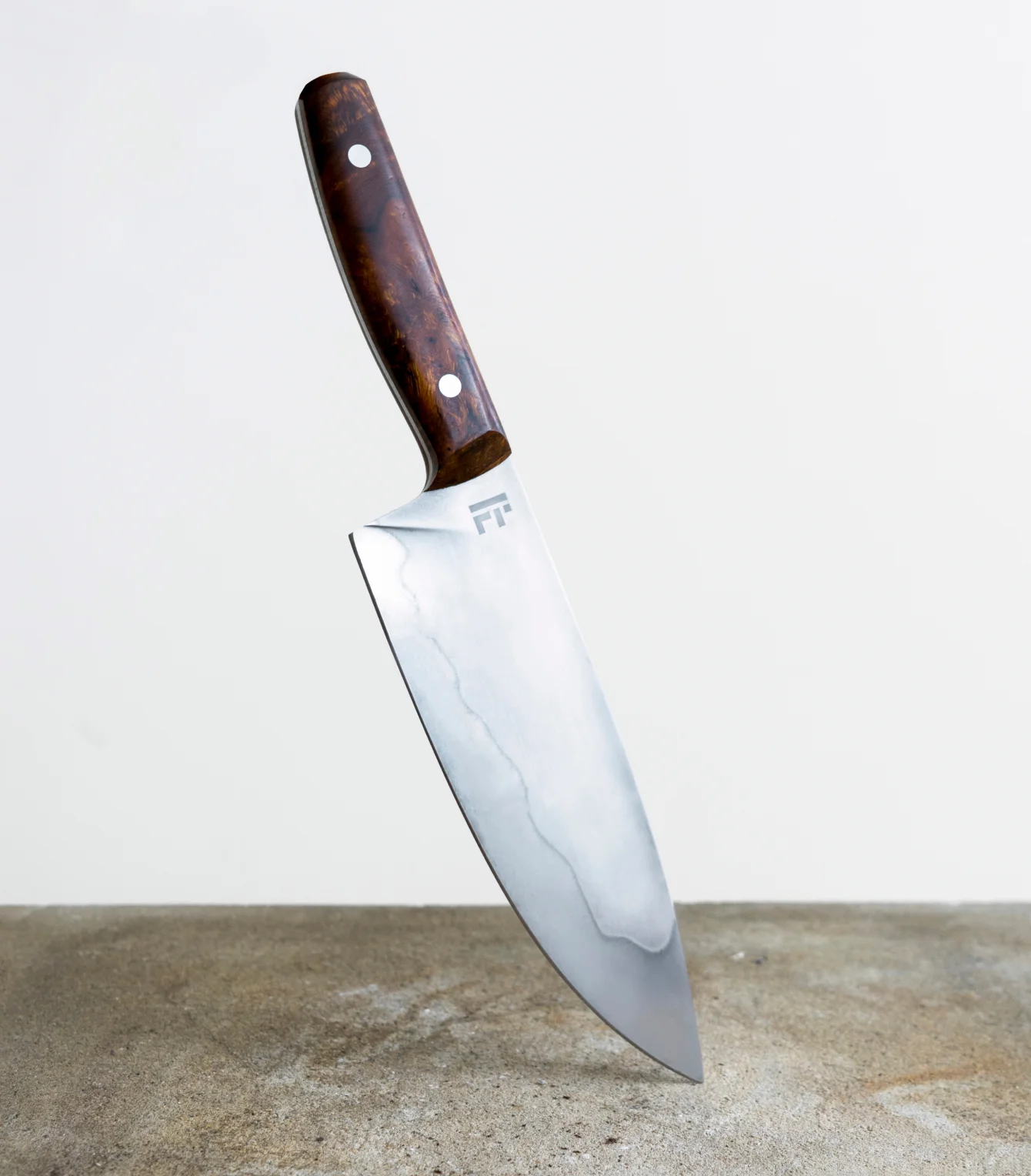
As an extension of our engagement, we designed a custom versatile chef’s knife featuring a carbon steel blade especially suited for rock chopping, and an ergonomic handle fashioned from Arizona Desert Ironwood, whose spellbinding burls complemented the knives subtle curves.
Independent artisan Lachlan Tobiason approached us to devise a logo mark for his handmade knives. His single thought-starter was the word “lock,” a homonym for his nickname.
We found ourselves exploring ideas around codes, languages, and other symbolic systems that unlock meaning. After exploring concepts ranging from a very literal cipher designs to plays on American Sign Language, we settled on pulling inspiration from Braille, a system of writing primarily used by visually impaired people.
It represents a junction between the visual and the tactile—rendering what is most typically only legible through vision, and making it felt in the mind’s eye. The sentiment felt especially resonant for a craftsperson who created something meaningful with their hands.
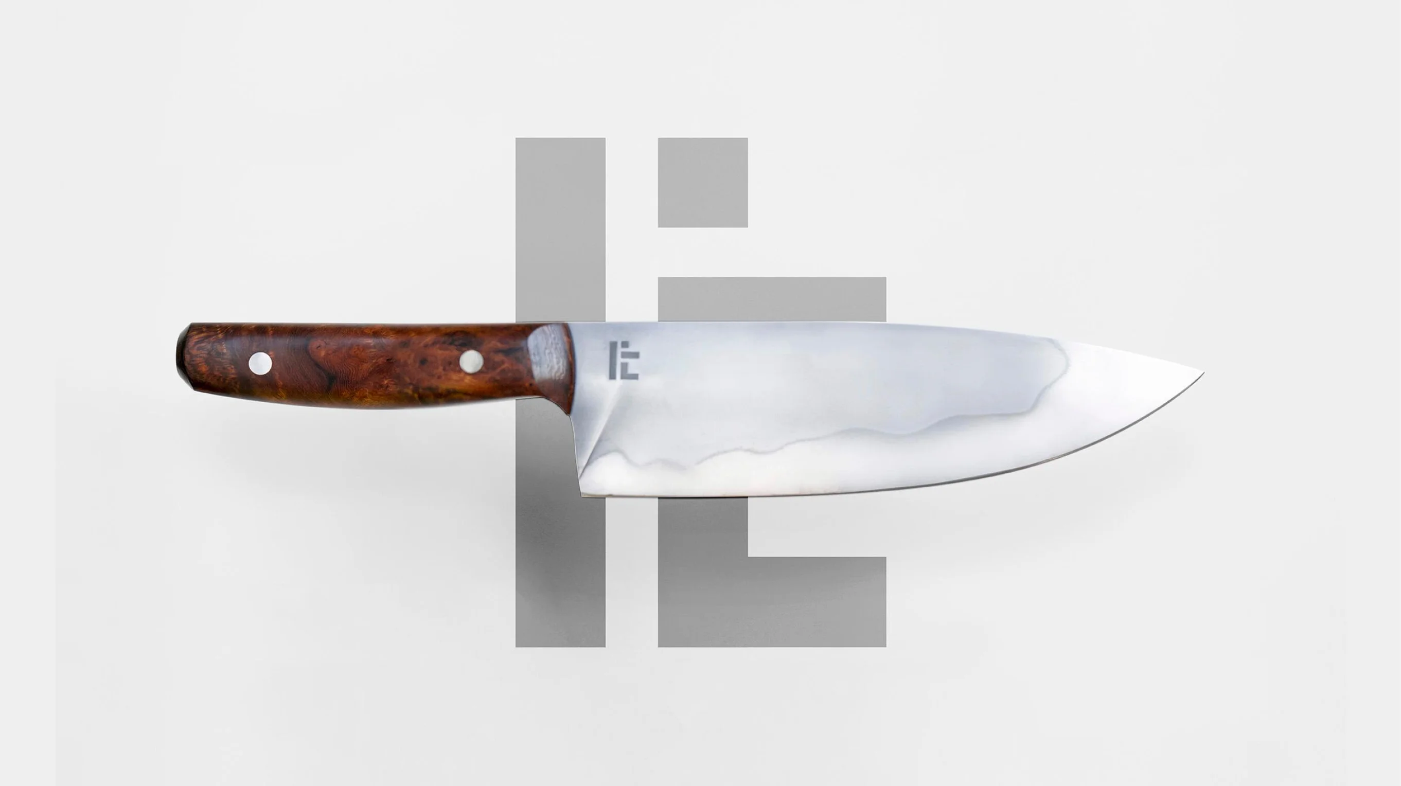
The final mark abstracts and condenses the Braille spelling of “Lach” into a geometric personal seal, which was acid etched into every blade.
As an extension of our engagement, we designed a custom versatile chef’s knife featuring a carbon steel blade especially suited for rock chopping, and an ergonomic handle fashioned from Arizona Desert Ironwood, whose spellbinding burls complemented the knives subtle curves.