1/9
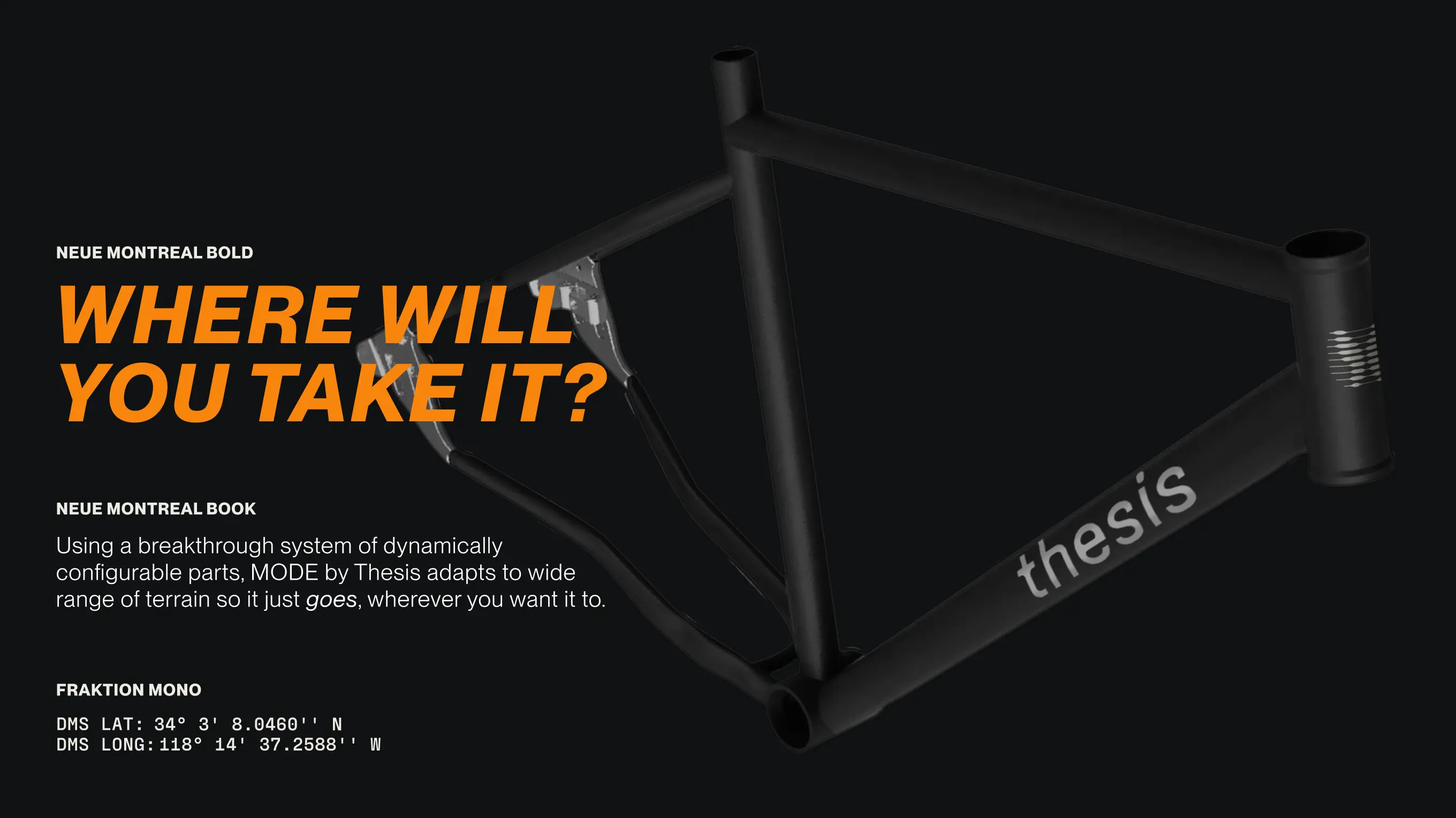
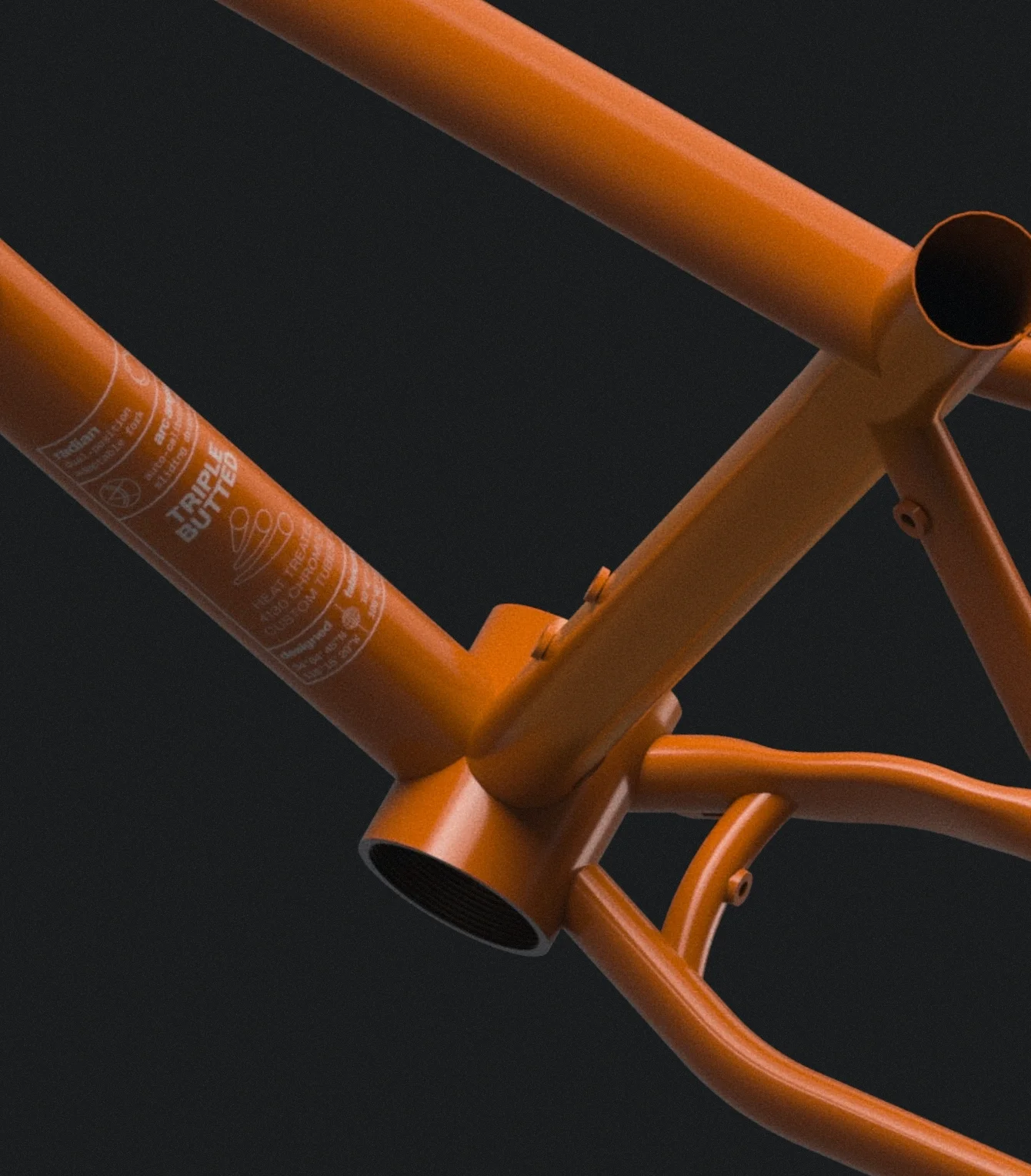
Thesis is an unconventional bike brand that makes highly versatile performance bikes. They approached us for a full rebrand to coincide with the launch of their new frame, which features a sliding dropout system that puts one bike on an unprecedented range of terrains.
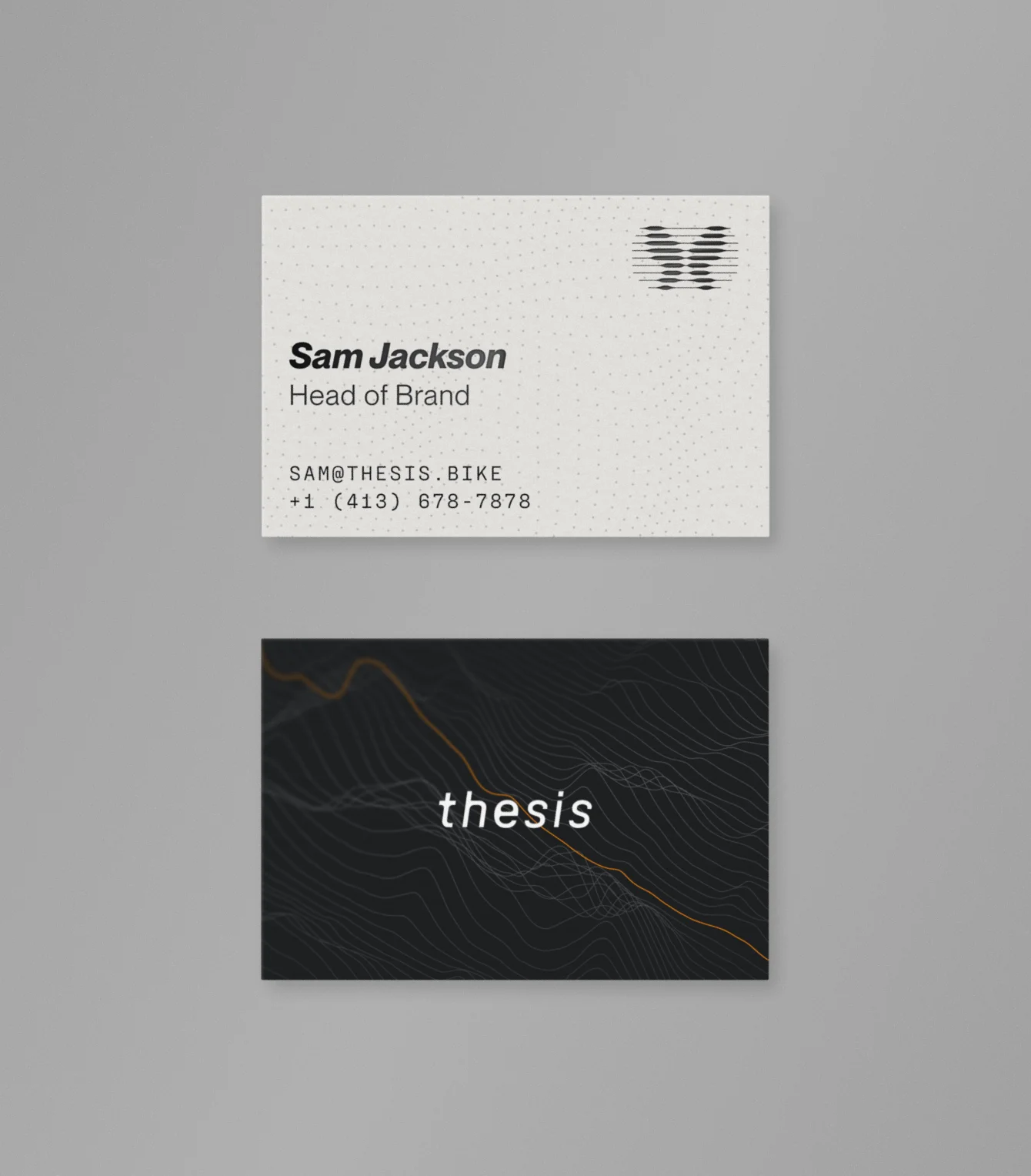
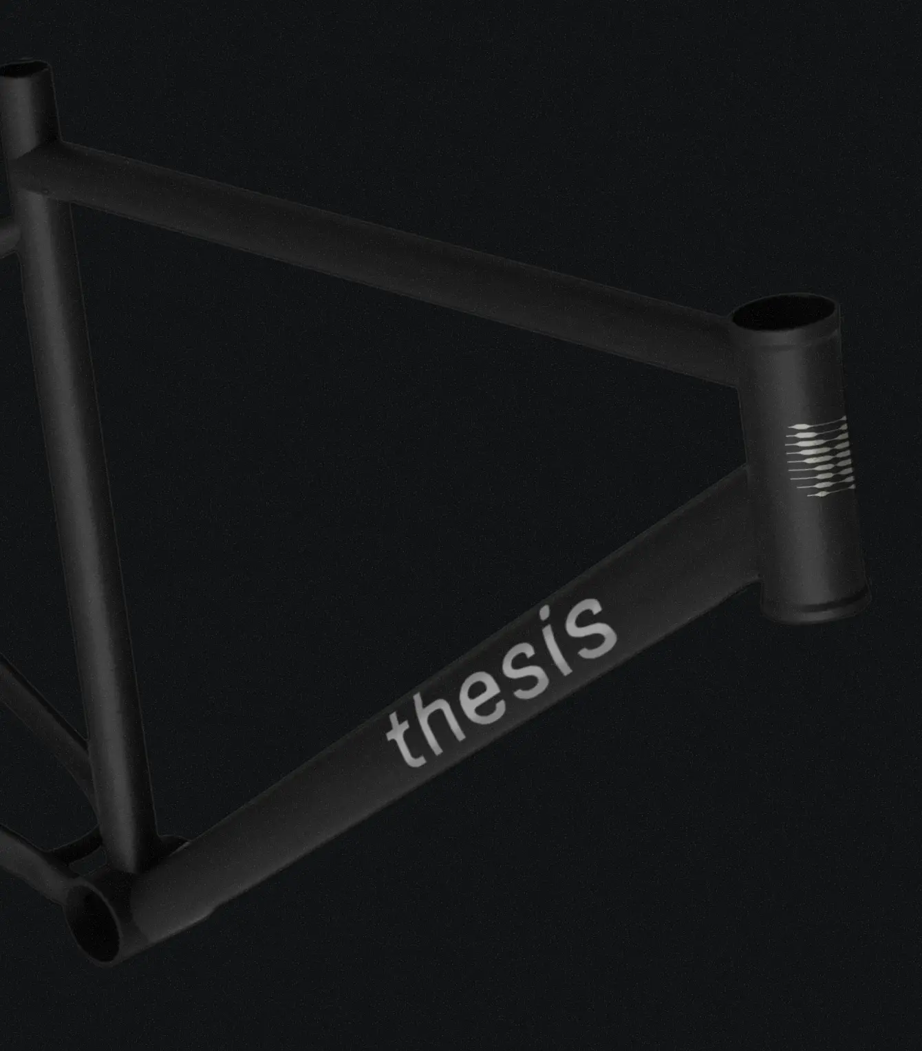
Thesis requested a wordmark that felt as soft and elegant as it did sleek and technical. We hand-tweaked the wordmark in Bugrino into a clean geometric sans that generates organic contrast through unexpected rounded forms and corners rather than stroke weight. The result is a dynamic, soft-spoken mark that stands out in an industry rife with uniformly thick, geometric sans serif logos.
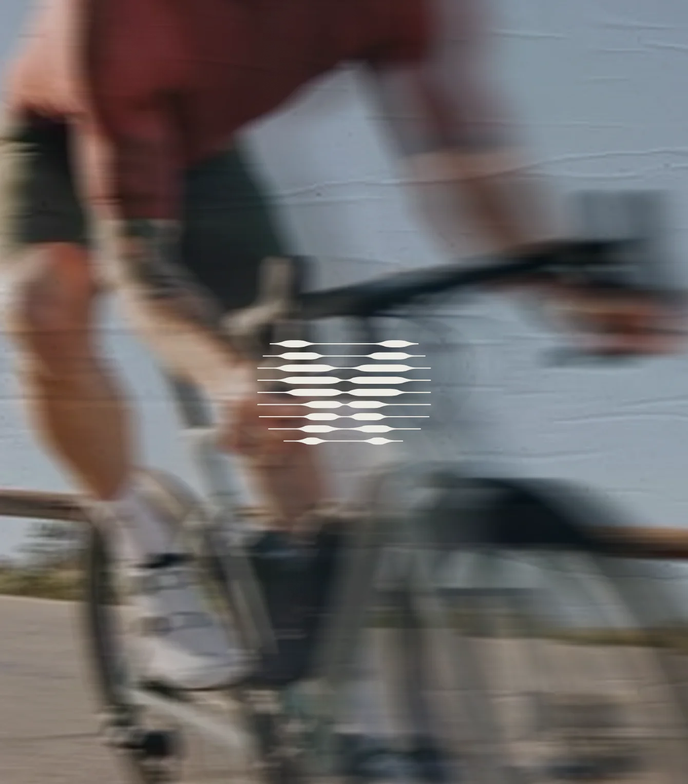
The logo updates their pet symbol, the Eudaemonia moth, named after the Greek word for happiness or welfare. The new mark renders the moth form through an inkbleed moiré-inspired lens, culminating in a playful, lightweight, stamp that brings tire treads and terrain to mind.
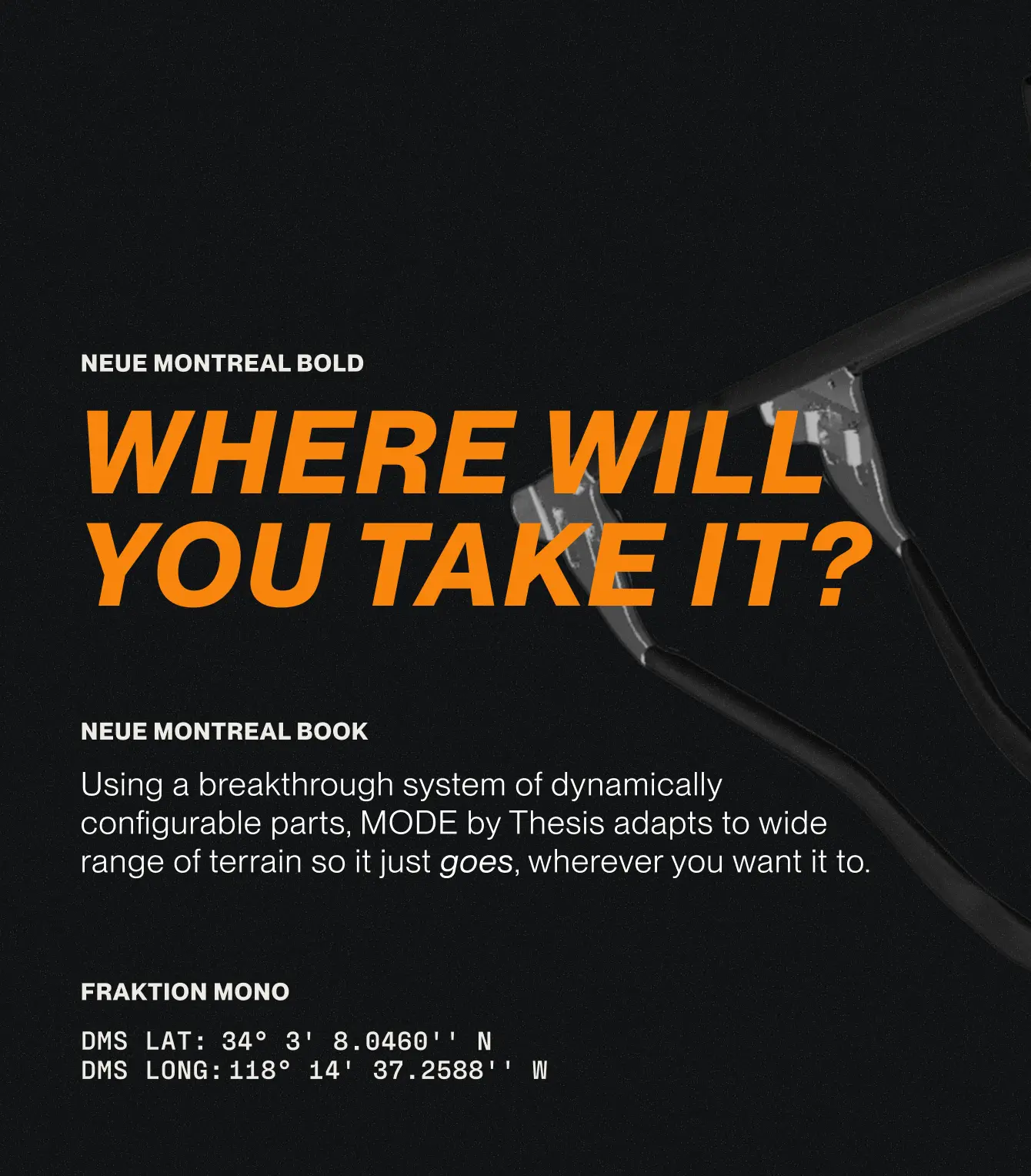
For the general design direction we collaged together abstracted topography and technical drawings, glass effects, and micrographics to create a visual system that feels textural, technical, and technologically advanced. Image treatments choices include natural, warm photography, speedy motion blurs, sporty tints, and heroic, seamless product images.
Thesis is an unconventional bike brand that makes highly versatile performance bikes. They approached us for a full rebrand to coincide with the launch of their new frame, which features a sliding dropout system that puts one bike on an unprecedented range of terrains.
Thesis requested a wordmark that felt as soft and elegant as it did sleek and technical. We hand-tweaked the wordmark in Bugrino into a clean geometric sans that generates organic contrast through unexpected rounded forms and corners rather than stroke weight. The result is a dynamic, soft-spoken mark that stands out in an industry rife with uniformly thick, geometric sans serif logos.
The logo updates their pet symbol, the Eudaemonia moth, named after the Greek word for happiness or welfare. The new mark renders the moth form through an inkbleed moiré-inspired lens, culminating in a playful, lightweight, stamp that brings tire treads and terrain to mind.
For the general design direction we collaged together abstracted topography and technical drawings, glass effects, and micrographics to create a visual system that feels textural, technical, and technologically advanced. Image treatments choices include natural, warm photography, speedy motion blurs, sporty tints, and heroic, seamless product images.