1/6
When the COVID-19 pandemic brought 10 million new players to The Sims 4, Electronic Arts realized the decade old game, with its ecosystem of hundreds of extra content packs, might not be as newcomer-friendly as it could be. With The Sims 4 set to be available for free, it was the perfect opportunity to refresh the game’s home on the web.
While chaos is a huge part of what makes the game so fun, we needed to craft a refreshingly simple and extendable design system to guide and educate new gamers across the e-commerce experience.
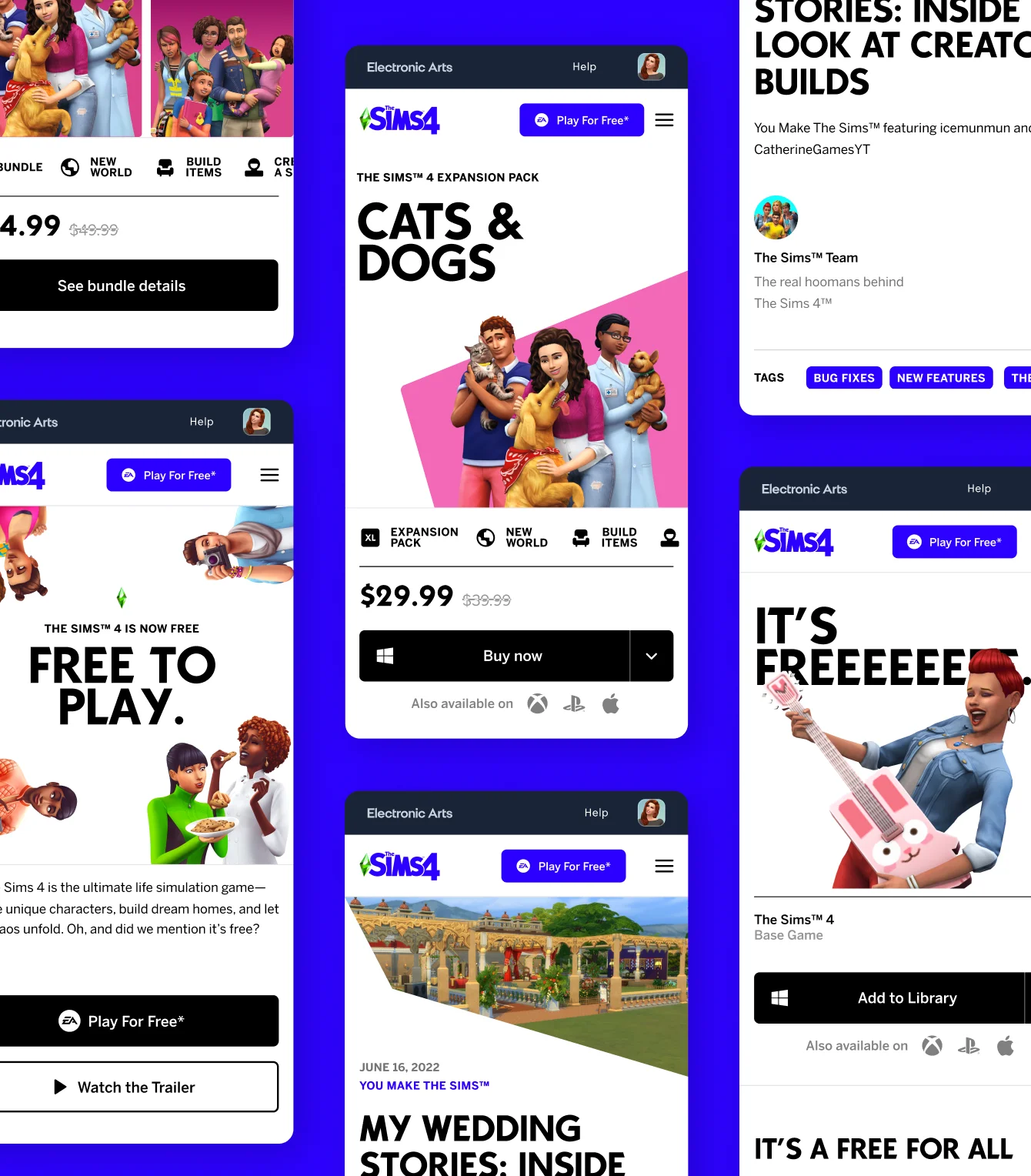
Our solution was “Sims Swiss,” a spacious, rational design language that wrangled artwork and assets from vampire worlds and vacation packs alike into an online hub that kept the chaos organized.
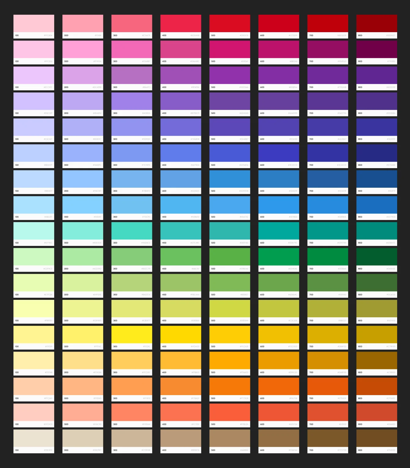
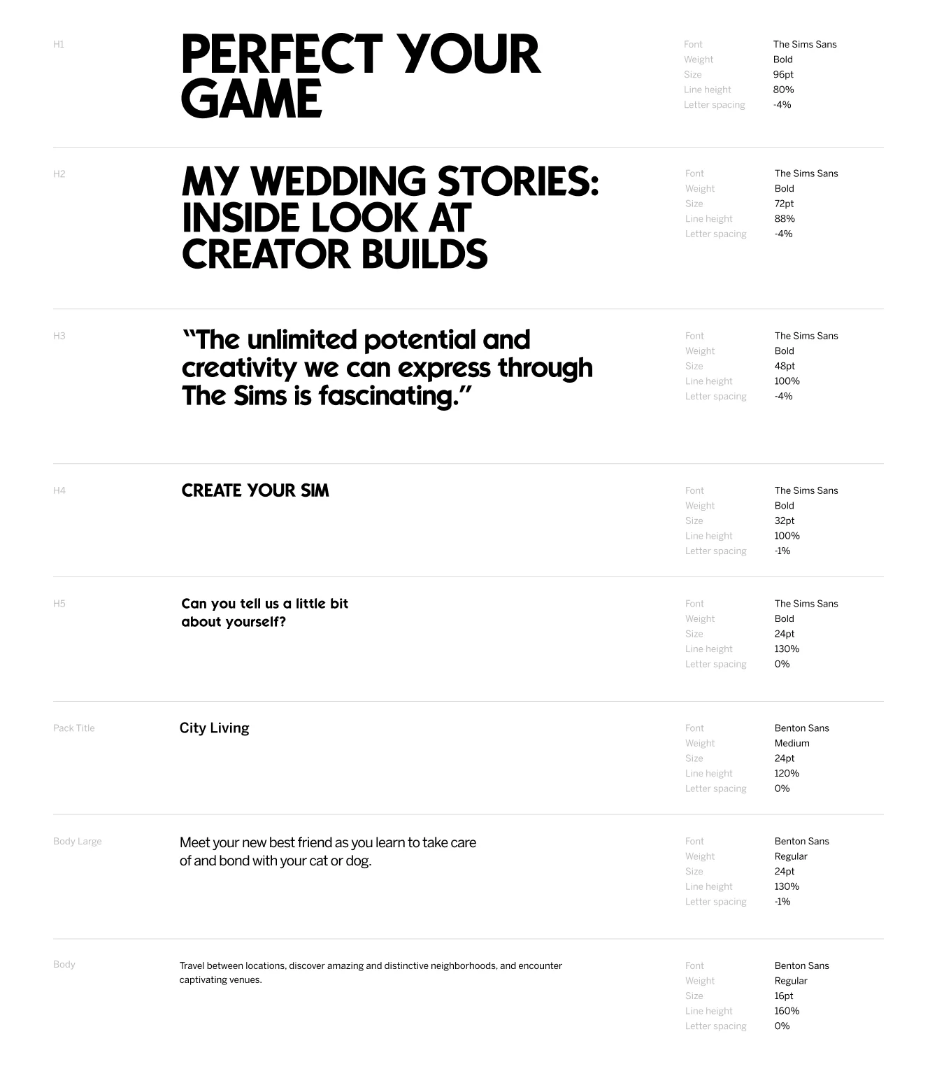
We took a rigorous, rule-based approach to components, color, type, key art, and pack details. Modular components ensured consistent presentation of information across the site. Through “t-shirt sizing,” iconography, and color-coded categorization, we made it easy to differentiate the varied scope of each add-on pack at a glance. Finally, simple geometric flourishes drew everything back to the iconic plumbob as the green, crystalline cherry on top.
The result was a clean, deeply navigable canvas that let the game’s inherent zaniness keep stealing the show.
When the COVID-19 pandemic brought 10 million new players to The Sims 4, Electronic Arts realized the decade old game, with its ecosystem of hundreds of extra content packs, might not be as newcomer-friendly as it could be. With The Sims 4 set to be available for free, it was the perfect opportunity to refresh the game’s home on the web.
While chaos is a huge part of what makes the game so fun, we needed to craft a refreshingly simple and extendable design system to guide and educate new gamers across the e-commerce experience.
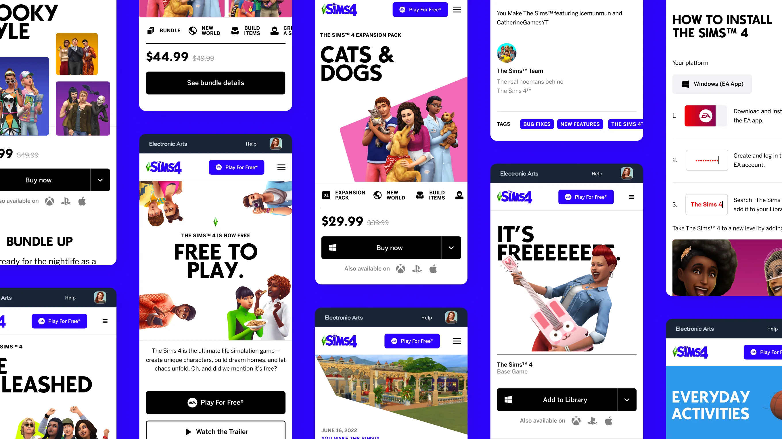
Our solution was “Sims Swiss,” a spacious, rational design language that wrangled artwork and assets from vampire worlds and vacation packs alike into an online hub that kept the chaos organized.
We took a rigorous, rule-based approach to components, color, type, key art, and pack details. Modular components ensured consistent presentation of information across the site. Through “t-shirt sizing,” iconography, and color-coded categorization, we made it easy to differentiate the varied scope of each add-on pack at a glance. Finally, simple geometric flourishes drew everything back to the iconic plumbob as the green, crystalline cherry on top.
The result was a clean, deeply navigable canvas that let the game’s inherent zaniness keep stealing the show.
Credits
Agency
Elephant
Creative Director
Michael Ashton
Associate Creative Directors
Thiago Duarte
Lu Kim
Tom Mandel
Senior Designers
Arthur de Almeida
Tanya Arendale
Designer
Lucia Jang
Copywriter
Meghan Hosley